Project Overview
The problem
Joy Scoop is a local ice cream parlor chain. Their mobile app is fairly simple when compared to their competitors. Joy Scoop wants to update their app with a mobile ordering solution to meet customers' increasing demands, as well as remaining competitive in the market.
The goal
Design a mobile ordering flow for Joy Scoop.
My role
UX designer designing a new feature for Joy Scoop app from conception to delivery.
My responsibilities
Conducting interviews, paper and digital wireframing, low and high fidelity prototyping, conducting usability studies, accounting for accessibility, and iterating on designs.
Project duration
May 2021 to July 2021
Understanding the user
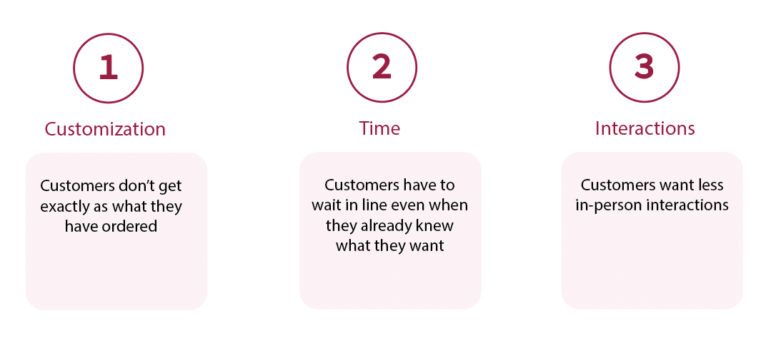
I conducted five user interviews to learn about customers' experience and behaviors when ordering ice cream from local parlors. After building empathy maps, I identified that a major pain point comes from ice cream customization. Customers complained a lot about getting wrong orders. Meanwhile, being able to place orders easily with fast payment options and less in-person interactions was mentioned several times as well.
Pain points
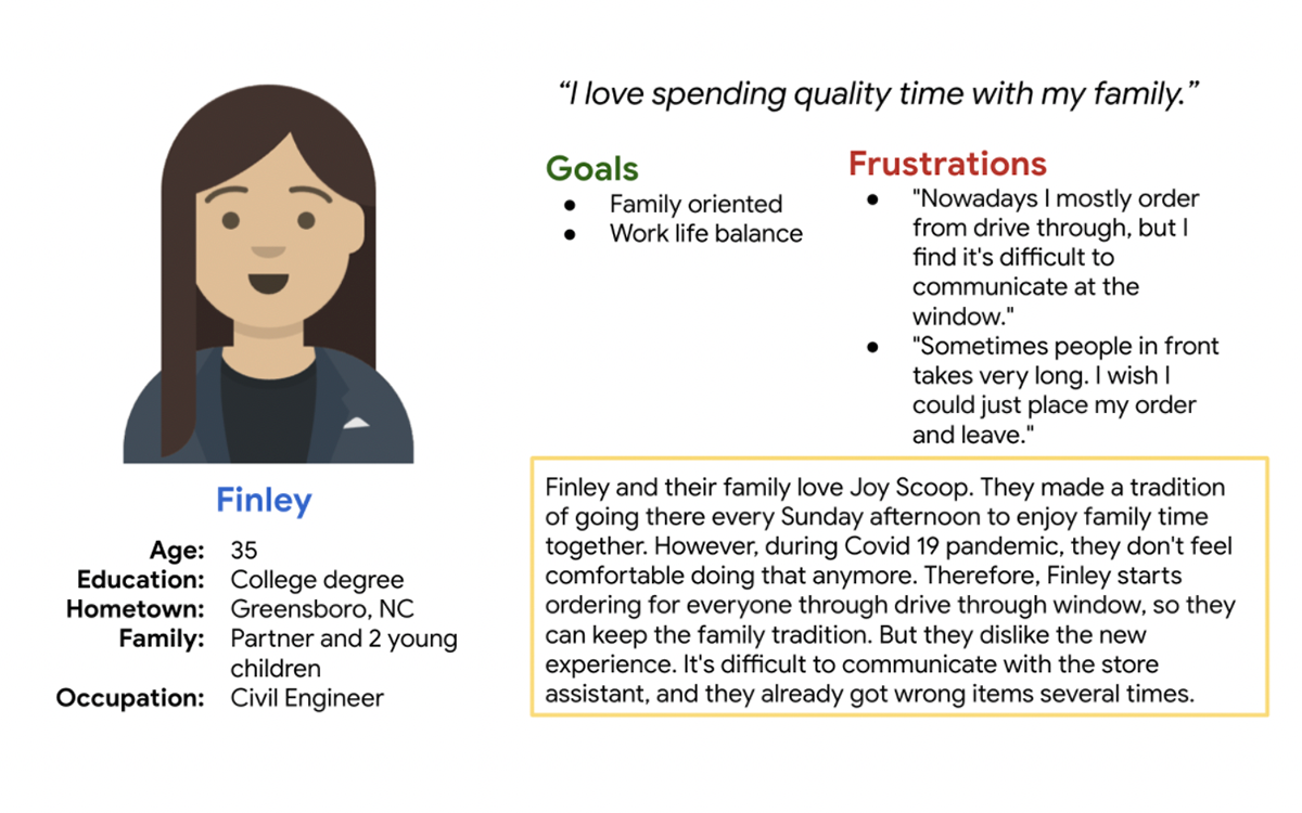
Persona & Problem statement
Finley is a working parent who needs an need a quick and easy way to place an order with less in-person interactions because they want to keep enjoying the ice cream while staying safe.
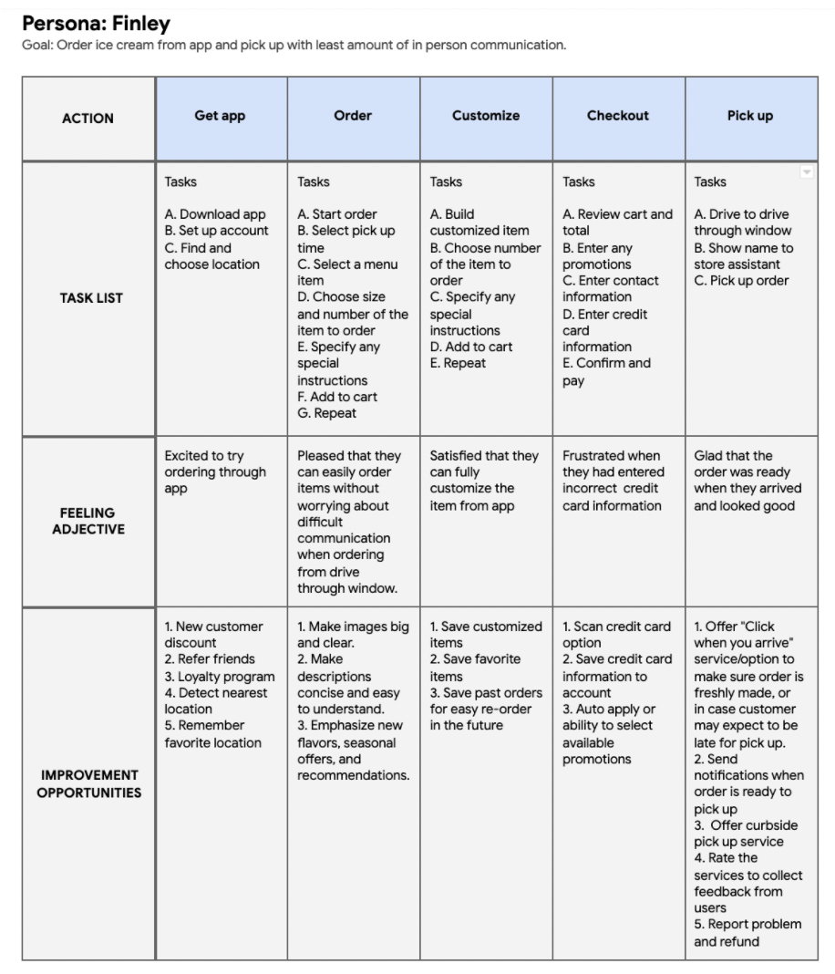
User journey map
The new mobile ordering feature would be a great help to users like Finley who needs a quick and easy way to place their order in advance to reduce in-person interactions, as well as saving time.
Competitive Audit
I conducted competitive audit to analyze the features of several direct and indirect competitors' app that offers mobile ordering feature and compared their ordering experience.
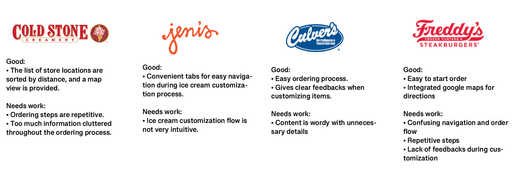
After analyzing other apps, I found that most of them lack a simple and straightforward customization and ordering process. In my work, I need to:
1. Design a simple and straightforward ordering flow.
2. Provide users with clear customization options and instructions.
Starting the design
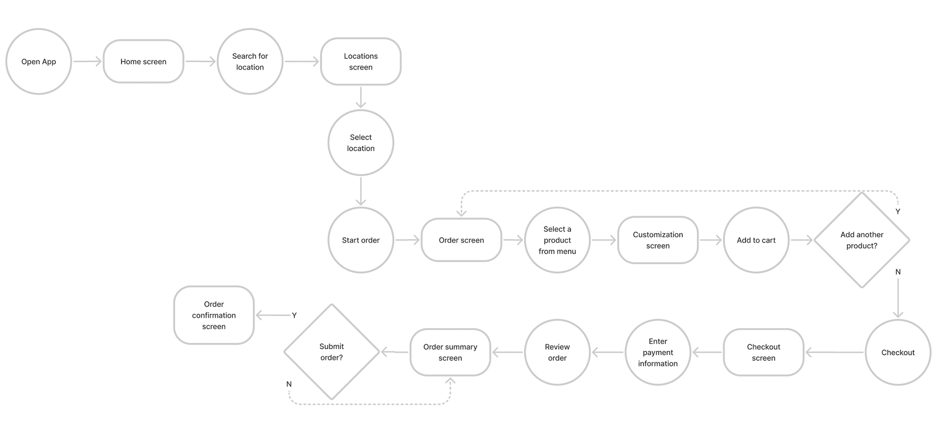
User flow
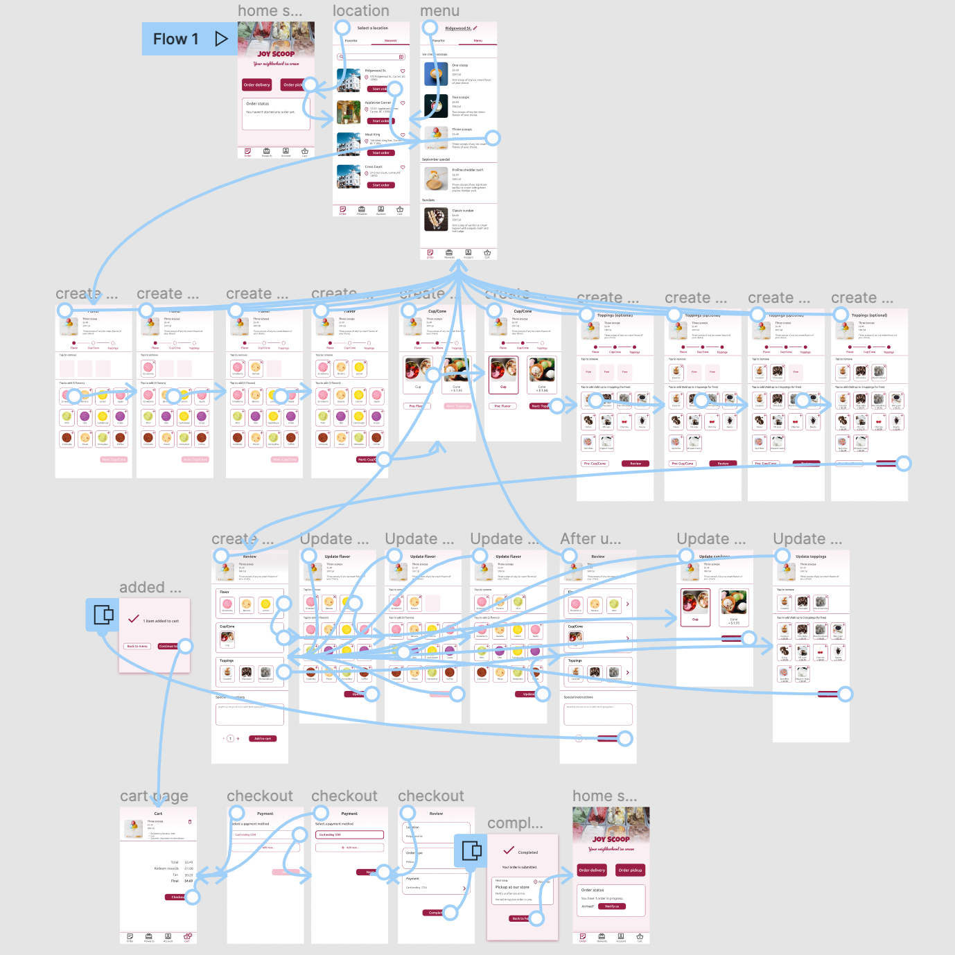
To better picture how users will move through the app effectively while staying engaged, I created user flow chart to outline the path that users will take to place an order. I considered the actions they will take, the decisions they will make, and the screens they will experience after the action or decision.
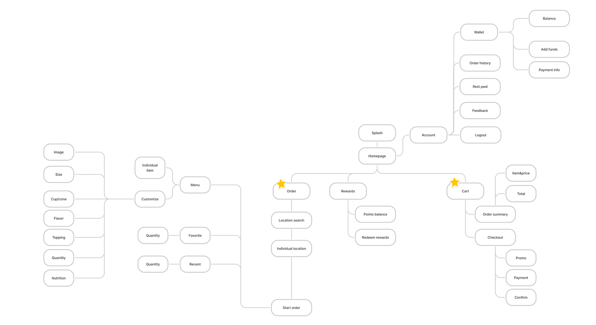
Information Architecture
Information Architecture helps me organize and sort the information I am going to presents, so users can successfully experience and interact with my design. The order customization and checkout process are the focus of this design.
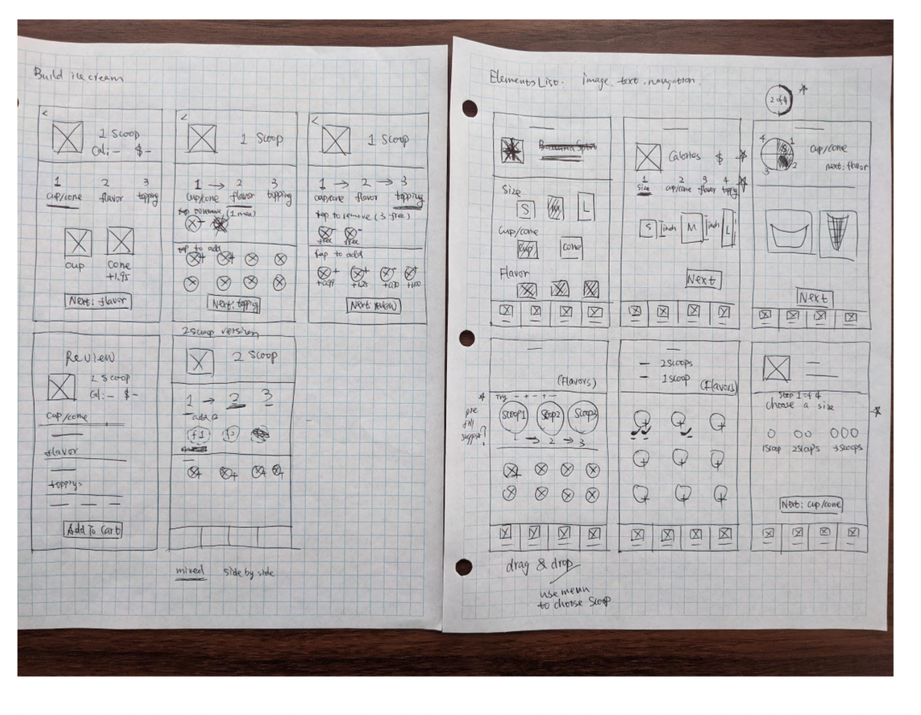
Paper wireframes
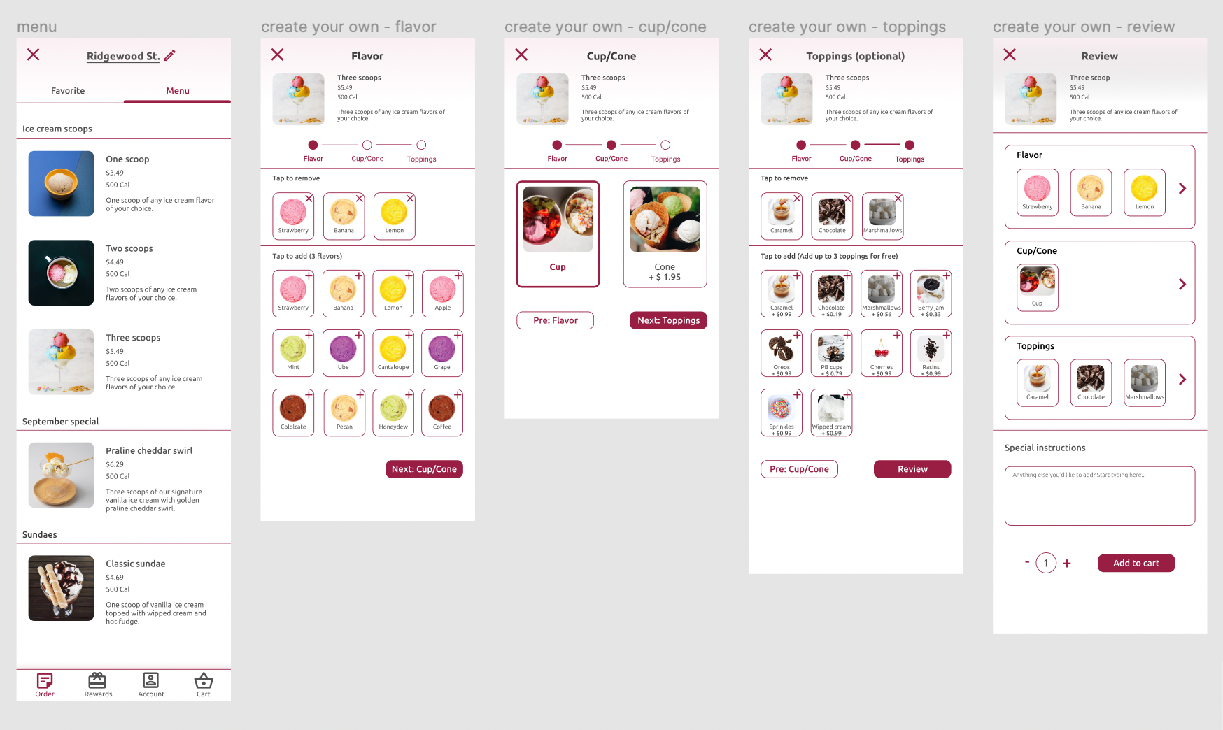
I used quick iterations of paper wireframes to sketch out screens. Here is an example of ice cream customization screens. I tried out many different ways to guide users through the steps in order to find the most straightforward one.
Digital Wireframes
I created digital wireframes based on the paper wireframes and initial feedbacks from users. The low-fidelity prototype connected the major flow of placing an ice cream order. This will be used for the following usability study.
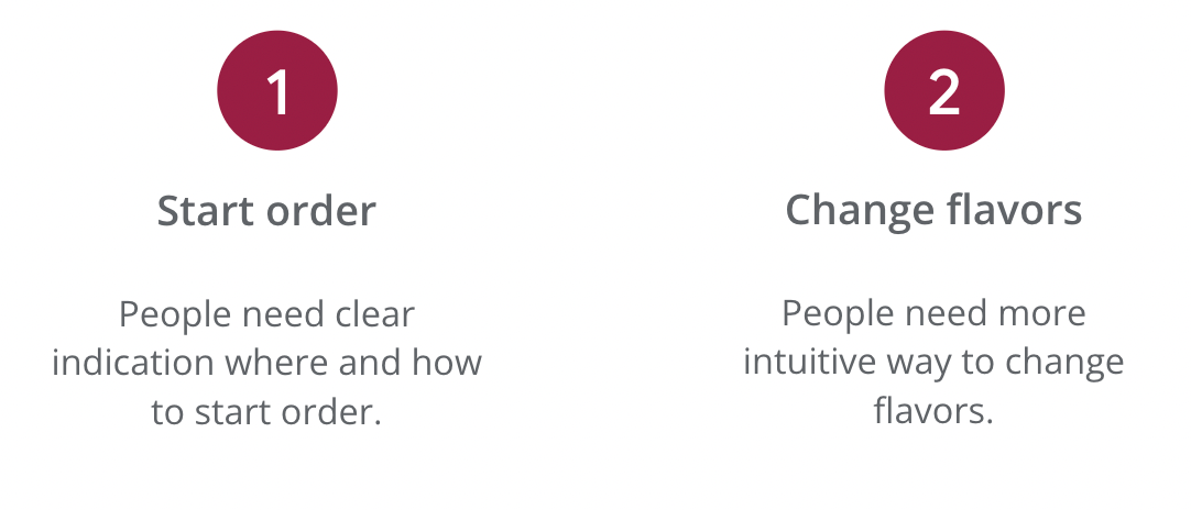
Usability study findings
I conducted unmoderated usability studies with users. The findings revealed areas need modifications, improvements, as well as areas need additional research.
Refining the design
Mockups
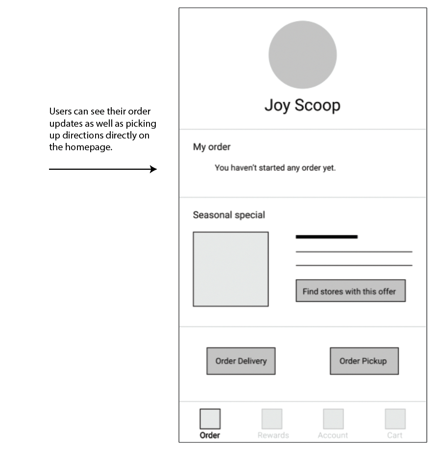
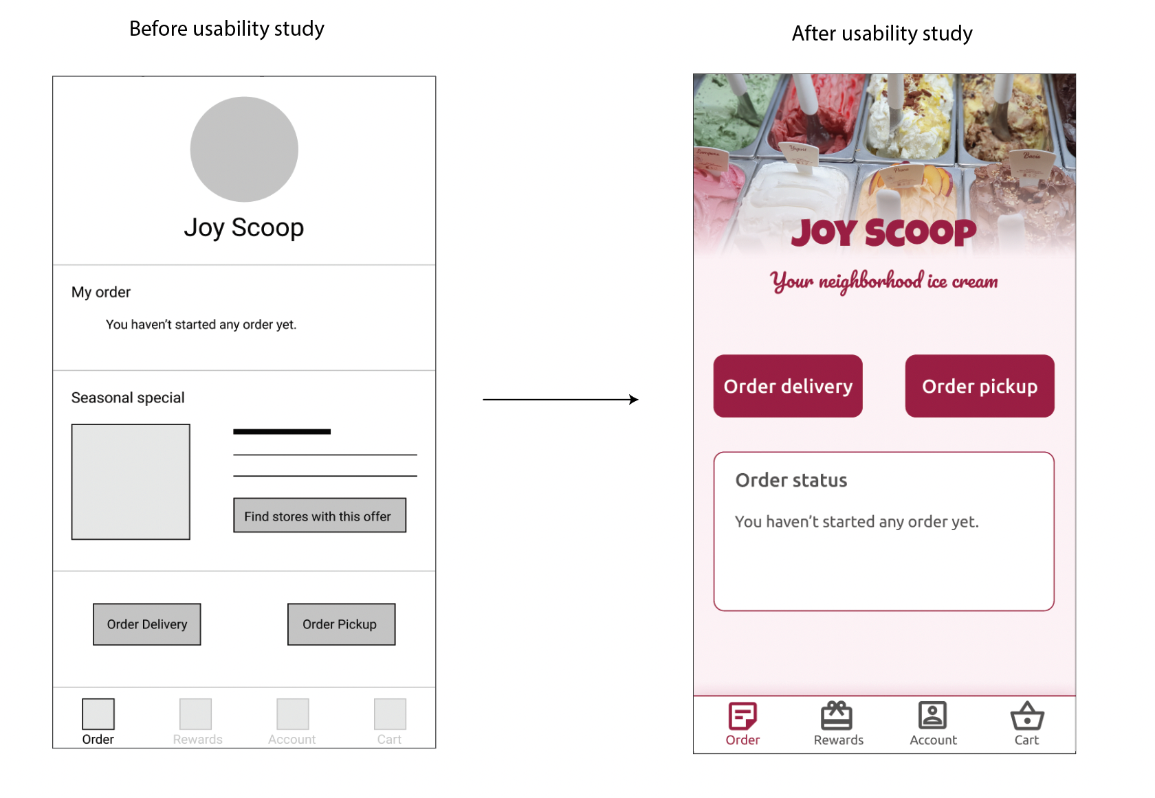
On the homepage, I wanted to give users an option to find the seasonal special item from a store, but this instead created confusion and distractions. Therefore I simplified the homepage by only providing ordering options. Users can still see any special item from the menu later.
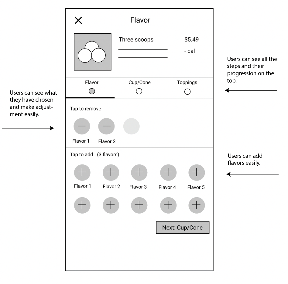
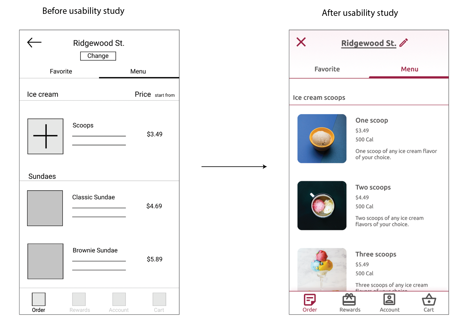
In the early design, users would pick "Scoops" option from the menu first, then choose number of scoops and flavors in the following customization steps. However, this made it difficult for them to change scoops or flavors correctly in the review step later since they are related. In the updated version, I removed the step of choosing the number of scoops. Users will pick that directly from the menu, and choose flavors in the following step, which reduced the complexity.
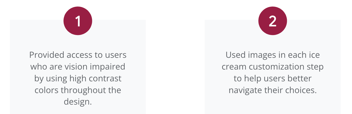
Accessibility considerations
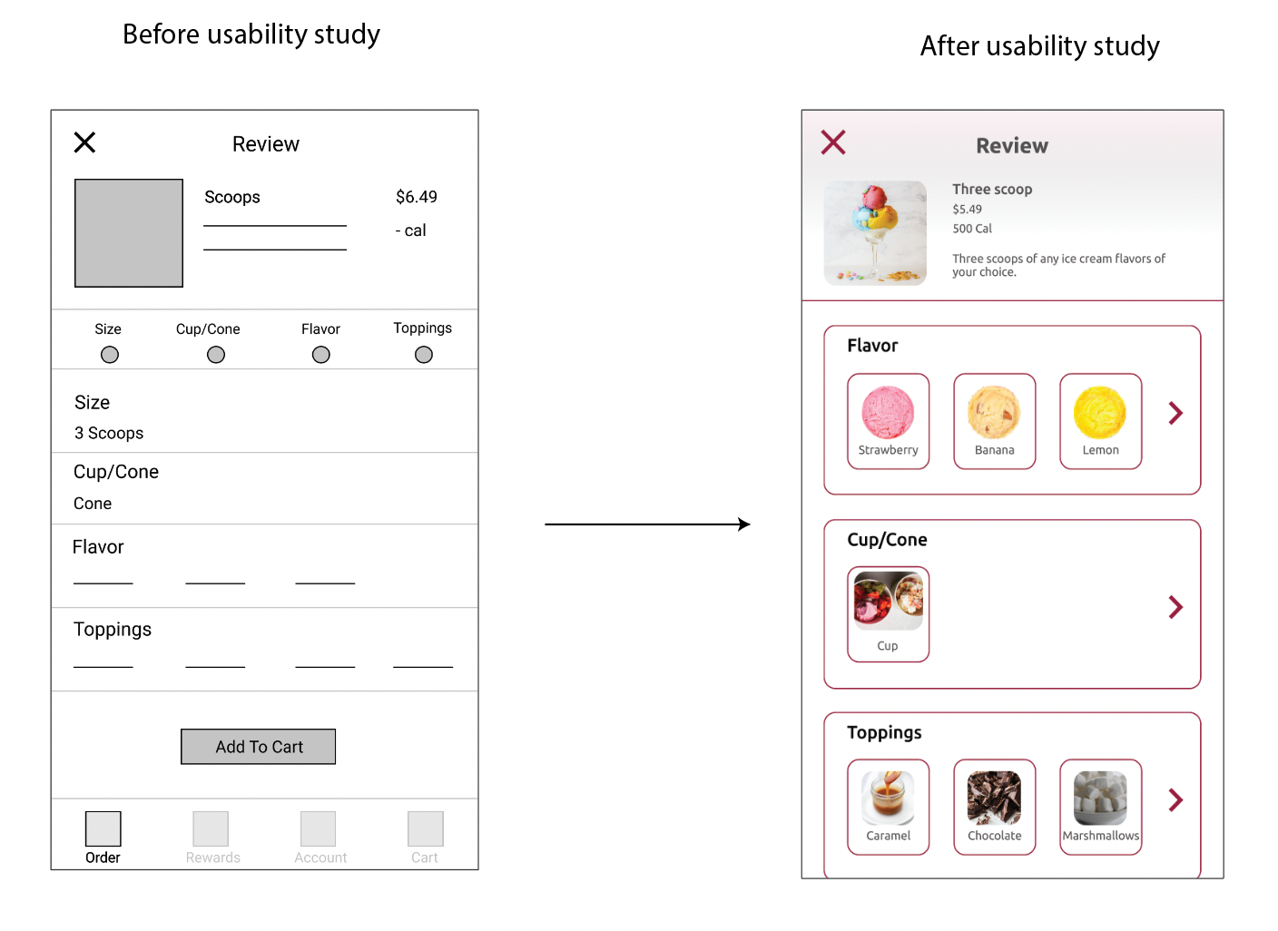
Refined designs - ice cream customization
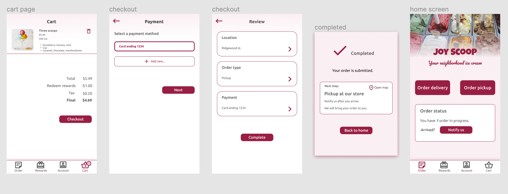
Refined designs - checkout process
High-fidelity prototype
The final high-fidelity prototype provides users with a clear and easy flow to customize and order their ice cream from the app.
What I Learned
As my first UX project, I have learned a lot along the way.
Process
Process is essential. It acts as a road map to guide me through the design. As I learned about different approaches and UX process, I was able to use the ones that were most helpful to my end goal. With a good process, I felt confident about the final product even during the times when there were so many uncertainties.
Focus on users
Focusing on users and their needs in each phase of the design process is crucial to a user centered design. It takes time, but I learned to remind myself constantly, think from users' perspective, account for their different characteristics, and involve them in the design process, so that I can ensure my design is usable and accessible.