Project Overview
The product
Yum Lounge is a cooking website for people easily find and view recipes. The target users are people who cook or seeking recipes. Yum Lounge's goal is to make cooking easy and accessible for everyone.
The problem
Many cooking websites have inefficient systems for browsing through recipes, and the recipe content is difficult to read and follow.
The goal
Design a cooking website to be user friendly by providing clear navigation and easy-to-read recipes.
My role
UX designer leading Yum Lounge website design
My responsibilities
Conducting interviews, paper and digital wireframing, low and high-fidelity prototyping, conducting usability studies, accounting for accessibility, iterating on designs and responsive design.
Project duration
June 2021 to August 2021
Understanding the user
I conducted user interviews, which I then turned into empathy maps to better understand the target user and their needs. I discovered that many target users find recipe searching results are overwhelming. In addition, the recipe content is not well organized and usually cannot accommodate different cooking needs. Many people are frustrated that they've searched for a particular recipe expectantly for a long time, but eventually ended up not making anything.
User pain points
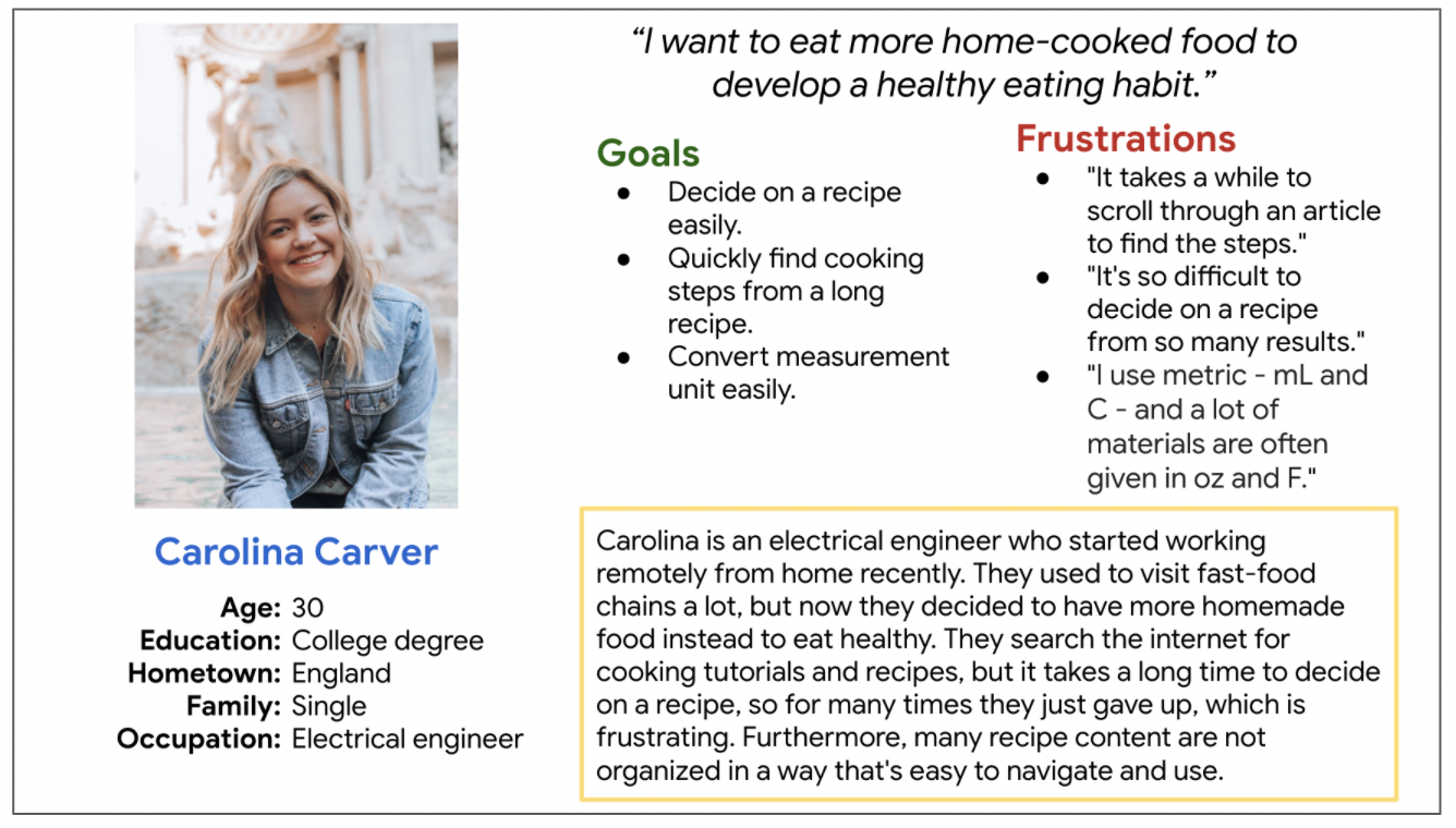
Persona & Problem Statement
Carolina is a work-from-home professional who needs to find well organized cooking recipes easily because they want to make more home-cooked meals with less stress.
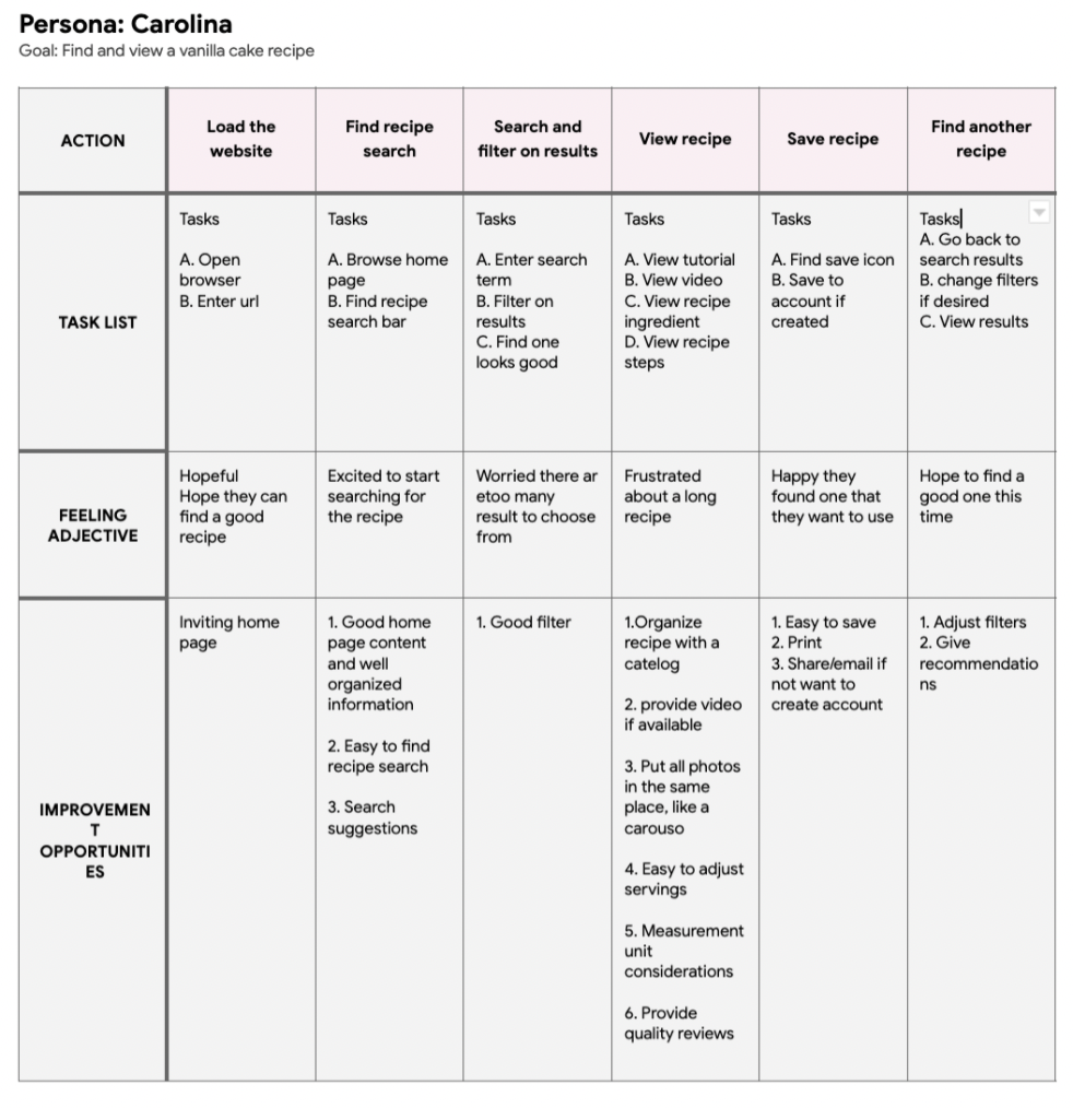
User Journey Map
I created a user journey map of Carolina's experience using the site to help identify possible pain points and improvement opportunities.
Starting the Design
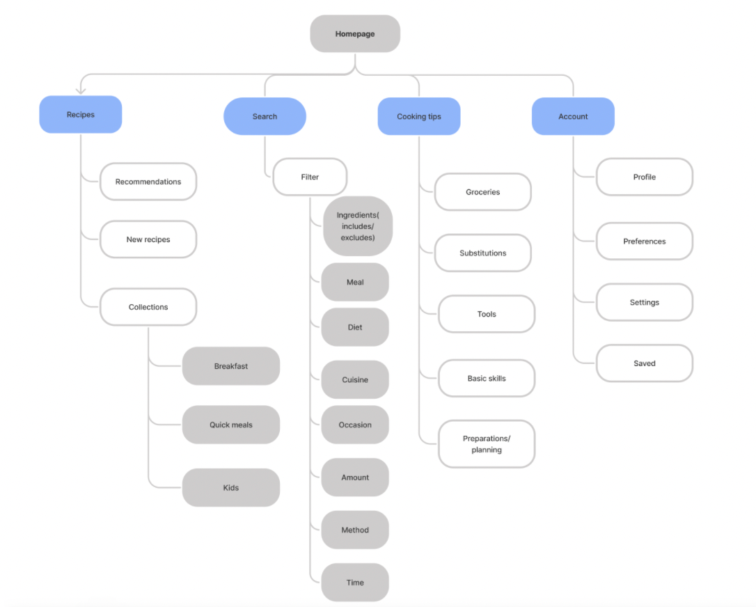
Sitemap
Site navigation and finding recipes are major pain points for the target users. With this knowledge in mind, I created sitemap to help me organize different content and decide on designs that make it easy for people to find what they need.
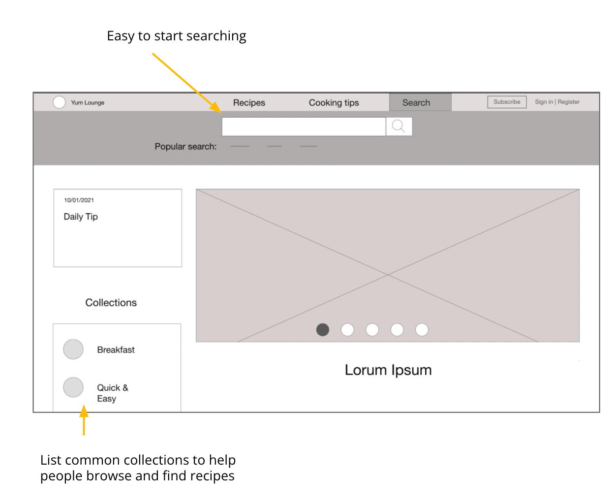
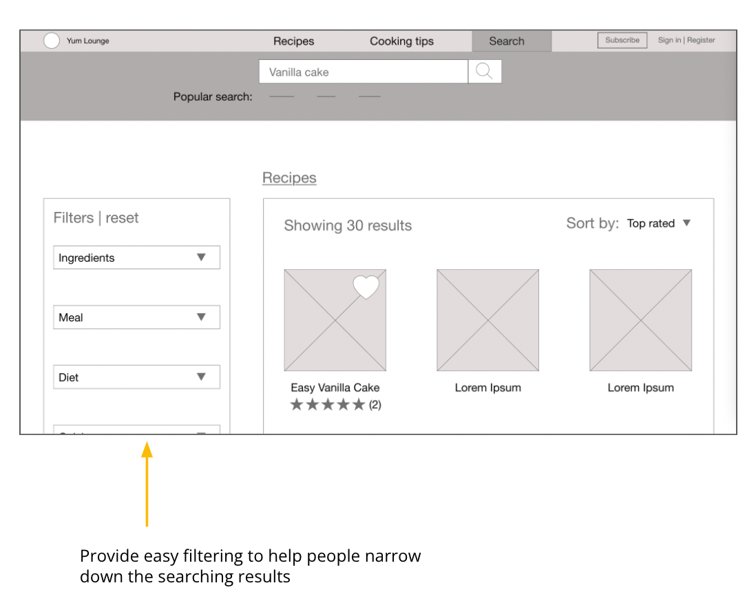
Digital wireframes
After sketching paper wireframes, I started to create digital wireframes. I kept user needs in mind and as guidelines to adjust my design.
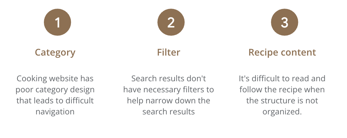
Usability study findings
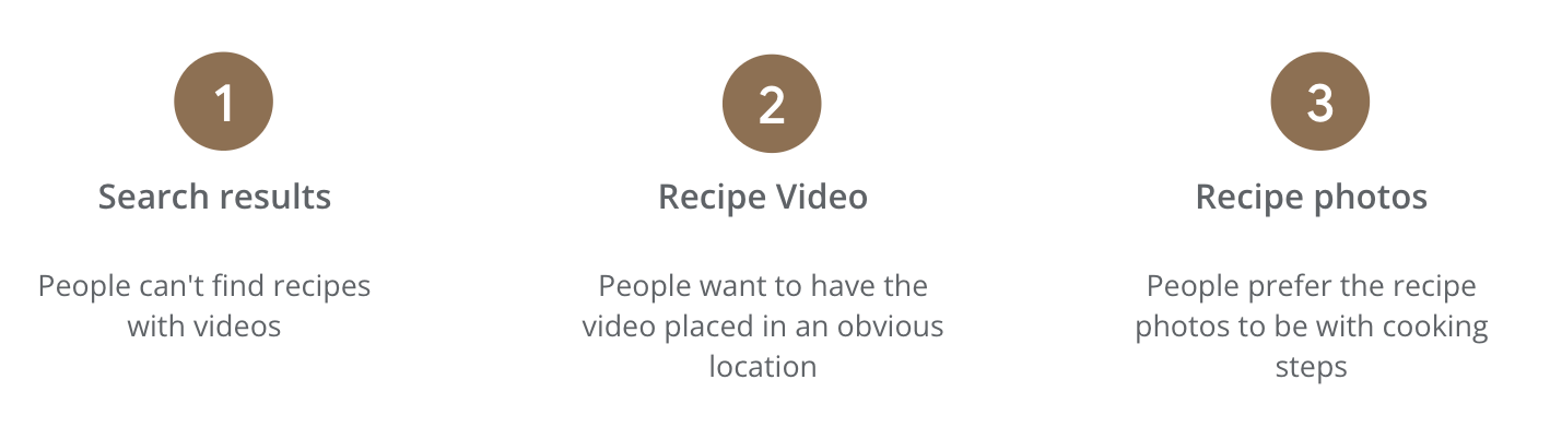
To start testing the designs, I created a low-fidelity prototype (view Yum Lounge Lo-Fi prototype). This prototype was used in an unmoderated usability study with 5 participants. Here are the main findings uncovered by the usability study:
Refining the design
Mockups
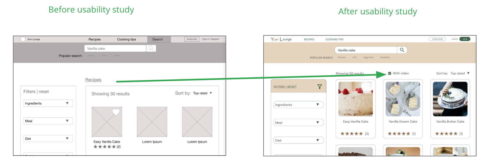
Based on the insights from the usability study, I made changes to improve users' experience when finding recipes. One of the changes I made is to provide a "with video" option on the search result page so people can easily find video recipes.
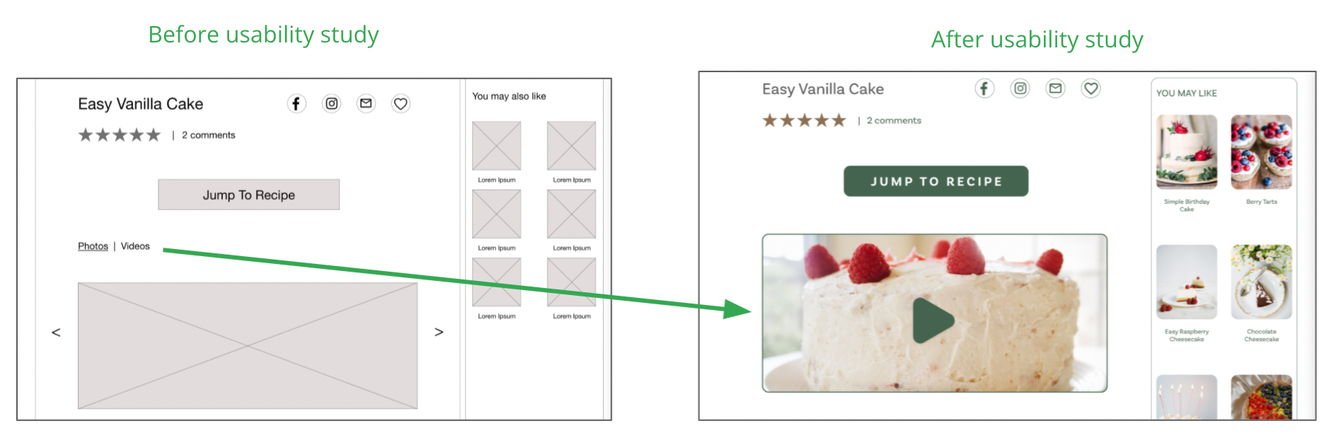
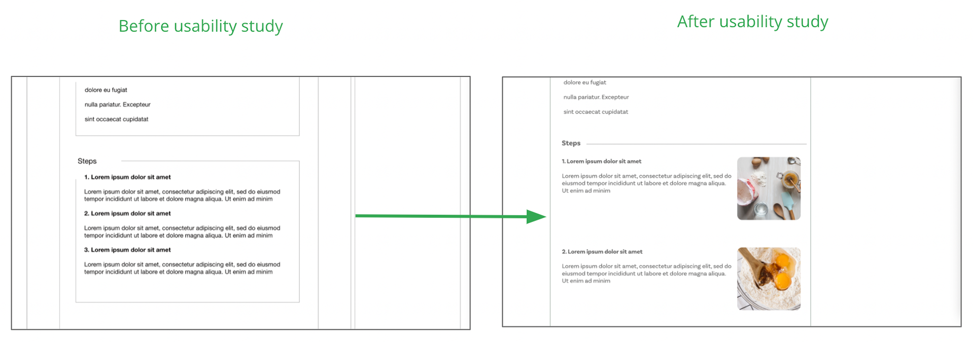
Additionally, many people expressed their preferences for visuals. They hope to see videos easily, as well as photo with each cooking step. Based on these feedbacks, I modified the recipe content page to bring recipe video to the front, and place photos in the cooking steps section instead of being separate on top of the recipe.
I included considerations for additional screen sizes in my mockups. Because users view from a variety of devices, it was important to optimize the experience for a range of device sizes so users have the smoothest experience possible.
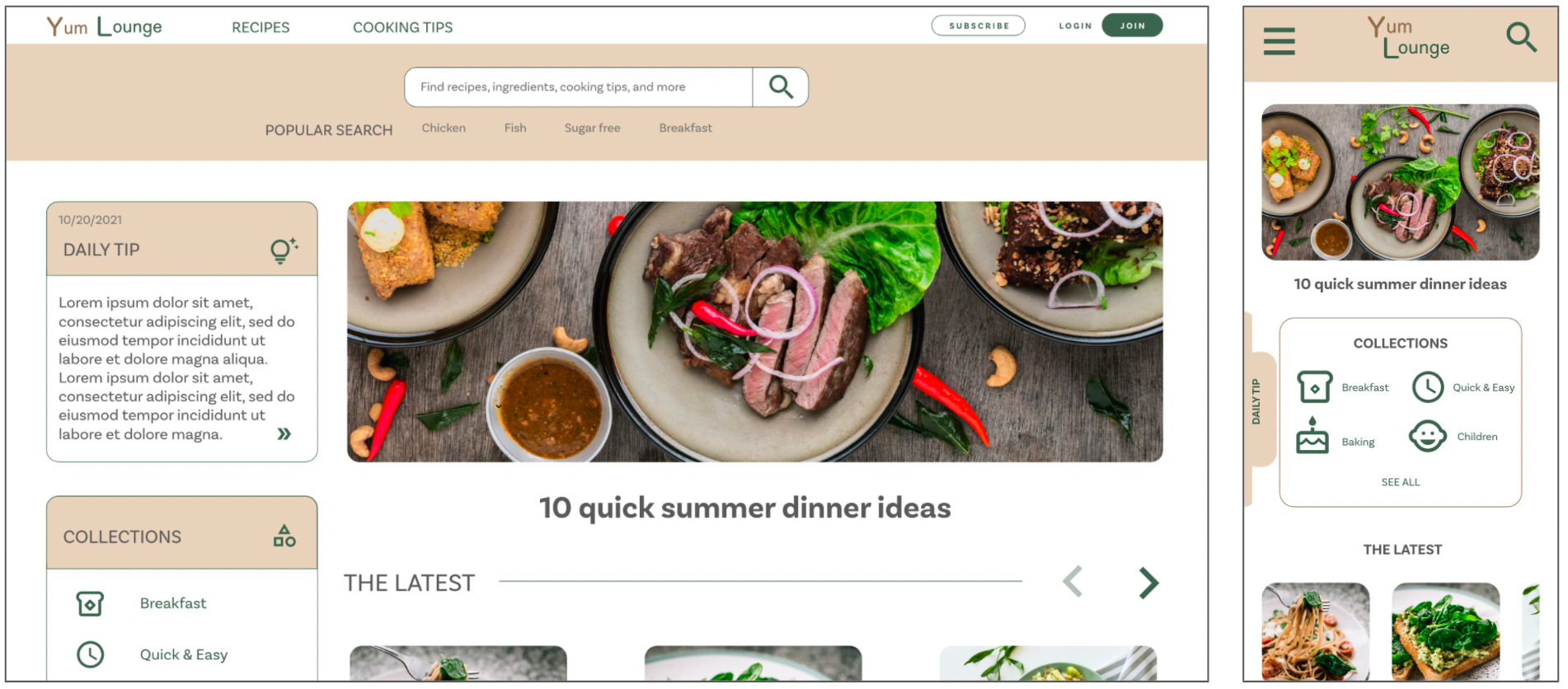
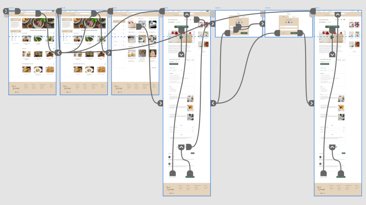
High fidelity prototype
My hi-fi prototype followed the same user flow as the lo-fi prototype, and included the design changes made after the usability study.
What I learned
I learned that even a small design change can have a huge impact on the user experience. The most important takeaway for me is to always focus on the real needs of the user when coming up with design ideas and solutions, and continue iterating on designs.